
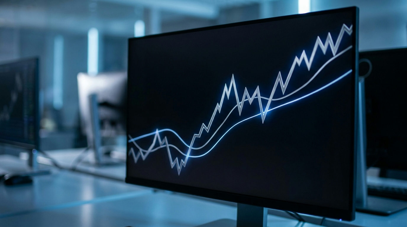
Moving averages are among the most common lines drawn on a silver chart. They smooth out daily noise so you can see the broader direction of the price. This guide explains how a silver moving average is calculated, what the popular 50-day and 200-day lines show, and why they describe the past rather than predict the future.
What is a silver moving average?
A moving average is the average price over a set number of recent periods, recalculated each period. For a 50-day moving average, you add up the last 50 daily closing prices and divide by 50. The next day, you drop the oldest price, add the newest, and calculate again. As a result, the line “moves” along with the chart.
The effect is a smoother line that follows the price with a delay. Short-term swings largely disappear, while longer trends remain visible.
A simple worked example
Here is a five-day moving average using hypothetical closing prices. These figures are for illustration only.
| Day | Closing price | 5-day moving average |
|---|---|---|
| 1 | $30.00 | n/a |
| 2 | $30.50 | n/a |
| 3 | $29.80 | n/a |
| 4 | $30.20 | n/a |
| 5 | $31.00 | $30.30 |
| 6 | $31.50 | $30.60 |
On day 5, the average of the five prices is $30.30. On day 6, day 1 drops out and day 6 joins, giving $30.60.
Simple vs exponential moving averages
The example above is a simple moving average (SMA). Every price in the window counts equally.
An exponential moving average (EMA) gives more weight to recent prices. Because of that, it reacts faster to new moves. However, it also reacts more to noise. Neither type is better in general. They simply trade off smoothness against speed.
What the 50-day and 200-day lines show
- 50-day moving average: a view of the medium-term trend, roughly the last two and a half months of trading.
- 200-day moving average: a view of the long-term trend, roughly the last ten months of trading.
Many market commentators note whether silver is trading above or below these lines. Price above a rising 200-day line is often described as a long-term uptrend. Price below a falling one is often described as a downtrend.
Commentators also point out “crossovers”. When the 50-day line crosses above the 200-day line, some call it a golden cross. When it crosses below, some call it a death cross. These labels describe what has already happened to the averages. They are not reliable forecasts on their own.
Limits of the silver moving average
Moving averages always lag the price, because they are built from past data. By the time a long average turns, much of a move may already be over.
In addition, silver often moves sharply. In choppy, sideways markets, price can cross back and forth over a moving average many times. That creates false signals. For this reason, moving averages are best treated as a way to describe a trend, not as trading instructions.
Tips for using moving averages on silver charts
- Check the price series behind the chart. A futures chart and a spot chart can give slightly different averages. See our guide to silver spot vs futures.
- Check the timeframe. A “50-period” average on an hourly chart is not the same as a 50-day average.
- Use the scale that suits your period. Our log vs linear chart guide explains why.
- Combine the line with context, such as supply, demand and the dollar, rather than relying on it alone.
Frequently asked questions
What is the 200-day moving average for silver?
It is the average of silver’s last 200 daily closing prices, recalculated every day. It shows the long-term trend.
What does it mean when silver is above its 50-day moving average?
It means the current price is higher than its average over roughly the last two and a half months. It describes recent strength, not future direction.
Is a golden cross a buy signal for silver?
Some traders treat it that way, but it is based on past prices and often lags. It is not a reliable forecast by itself.
Should I use a simple or exponential moving average?
It depends on your purpose. Simple averages are smoother, while exponential ones react faster to recent prices.
Sources
This article is general information and education, not financial advice or a trading signal. Example prices are for illustration only. Past price patterns do not predict future results.
Written and reviewed by the SilverPriceCharts.com editorial team. Sources are linked above.