
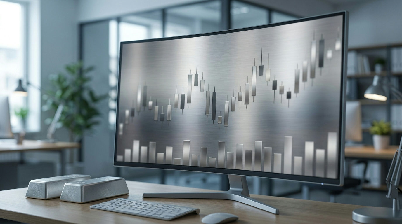
Silver price charts pack a lot of information into a small space: the price source, the currency, the unit, the timeframe and often several indicators. Learning how to read silver price charts means checking each of these before drawing any conclusion. This guide walks through the parts of a chart, the main chart types, and a simple checklist you can use on any silver chart.
Step 1: Check what price the chart shows
First of all, not every silver chart shows the same price. There are three common sources:
- Spot price. A live price for immediate delivery, usually derived from the most active COMEX futures contract.
- Futures price. The price of a specific COMEX contract month, often labelled SI.
- LBMA silver price. A single daily benchmark set by auction in London.
These prices are close but not identical. Our guides to silver spot vs futures, COMEX silver futures and the LBMA silver price explain the differences.
Step 2: Check the currency and unit
Most silver charts show US dollars per troy ounce. However, some show prices in other currencies, or per gram or kilo. For example, a move on a euro chart can look very different from a move on a dollar chart, because the exchange rate is built in. See our guides to troy ounce silver conversions and the silver price and US dollar.
Step 3: Check the timeframe and scale
The timeframe changes the story. A one-day chart shows intraday noise, whereas a ten-year chart shows the long-term trend. Therefore, always note the period before judging whether a move is large or small.
The vertical scale matters too. Linear scales show dollar changes, while logarithmic scales show percentage changes. For long histories, a log scale usually gives a fairer picture. Our log vs linear chart guide explains why.
Step 4: Understand the chart type
| Chart type | What each point shows | Best for |
|---|---|---|
| Line chart | One price per period, usually the close | Seeing the overall trend clearly |
| Bar (OHLC) chart | Open, high, low and close for each period | Seeing the range traded in each period |
| Candlestick chart | Open, high, low and close, with a coloured body | Seeing direction and range at a glance |
On a candlestick chart, the thick “body” runs from the opening price to the closing price. Meanwhile, the thin lines, called wicks or shadows, show the highest and lowest prices in the period. A body is usually one colour when the price closed higher than it opened, and another when it closed lower. Colours vary by platform, so check the legend.
Step 5: Look at volume, where available
Futures charts often include trading volume as bars along the bottom. Volume shows how much trading happened in each period. As a rule, a move on heavy volume carries more weight than a move on light volume.
However, spot charts often have no volume, because much spot trading happens over the counter between dealers rather than on one exchange. So if a chart shows no volume, that is normal.
Step 6: Read common indicators with care
Many charts add lines or zones to help describe the price:
- Moving averages smooth the price to show the trend. See our silver moving average guide.
- Support and resistance mark zones where the price has turned before. See our support and resistance guide.
- The gold-silver ratio compares silver with gold. See our gold silver ratio guide.
Keep in mind that these tools describe what has already happened. They do not predict what will happen next.
Step 7: Add context from outside the chart
A chart shows the result of market forces, not the forces themselves. To understand a move, therefore, look at what might be behind it: industrial demand, investment flows, mine supply, the dollar and interest rates. Our guide to what drives silver prices covers each one.
It also helps to remember the gap between chart prices and real-world prices. Retail buyers pay a premium over spot and face a dealer spread, as our guides to silver premiums and the silver bid ask spread explain.
How to read silver price charts: a quick checklist
In short, knowing how to read silver price charts comes down to a handful of questions. Run through them every time:
- Which price: spot, futures or LBMA benchmark?
- Which currency and unit?
- Which timeframe?
- Linear or log scale?
- Line, bar or candlestick?
- Is volume shown, and how heavy is it?
- Which indicators are drawn, and what do they measure?
- What outside factors could explain the move?
Frequently asked questions
How do you read a silver price chart?
First check the price source, currency, unit, timeframe and scale. Then read the chart type and any indicators, and add outside context.
What does a candlestick show on a silver chart?
Each candle shows the opening, closing, highest and lowest price for one period. The body shows open to close, and the wicks show the range.
Why do silver charts from different websites look different?
They may use different price sources, currencies, units, timeframes or scales. Small differences in any of these change how the chart looks.
Why does my spot silver chart have no volume?
Much spot trading happens over the counter, not on a single exchange, so there is often no central volume figure to show.
Sources
- CME Group: Silver Product Overview
- CME Group: Silver Futures Contract Specs
- LBMA: LBMA Silver Price
- Kitco: Silver Price Today
This article is general information and education, not financial advice or a trading signal. Chart patterns describe past prices and do not predict future results.
Written and reviewed by the SilverPriceCharts.com editorial team. Sources are linked above.